Statistics 4: Multivariate Models and Choosing the Best Model
Confidence Intervals
- Give a sense of the precision of your estimation
- Not a statement of how much of the data your estimation encompasses
- Not a statement of limits on the range of the true value you’re estimating
- Involves standard deviations
Example: Estimate Average Temperature in September with Confidence Intervals
In [1]:
import pandas as pd
import numpy as np
import os

data_dir = "../downloads/seattle_weather/"
weather_files = [
    data_dir + f for f in os.listdir(data_dir) if f.startswith("MonthlyHistory")]
seattle_weather = pd.read_csv(weather_files[0])
rename_these = {}
for col in seattle_weather.columns:
    rename_these[col] = col.replace(" ", "_")
rename_these["Mean_TemperatureF"] = "mean_temp"
seattle_weather.rename(columns=rename_these, inplace=True)

for f in weather_files[1:]:
    indata = pd.read_csv(f)
    rename_these = {}
    for col in indata.columns:
        rename_these[col] = col.replace(" ", "_")
        if col == "PDT":
            rename_these[col] = "PST"
        if col == "Mean TemperatureF":
            rename_these[col] = "mean_temp"
    indata.rename(columns=rename_these, inplace=True)
    seattle_weather = pd.concat((seattle_weather, indata), ignore_index=True)

seattle_weather["year"] = seattle_weather.PST.map(lambda x: float(x.split("-")[0]))
seattle_weather["month"] = seattle_weather.PST.map(lambda x: float(x.split("-")[1]))
seattle_weather["day"] = seattle_weather.PST.map(lambda x: float(x.split("-")[2]))
In [2]:
aggregate = {"month": [], "avg_monthly_temp":[], "stdev":[]}
for ii in range(1, 13):
    aggregate["month"].append(ii)
    aggregate["avg_monthly_temp"].append(np.mean(seattle_weather[seattle_weather.month == ii].mean_temp))
    aggregate["stdev"].append(np.std(seattle_weather[seattle_weather.month == ii].mean_temp))

aggregate = pd.DataFrame(aggregate)
In [3]:
import calendar #just for letting me turn integers 1-12 into month names; doesn't take iterables
import matplotlib.pyplot as plt
%matplotlib inline

month_names = [calendar.month_abbr[ii] for ii in range(1, 13)]

plt.figure(figsize=(12, 4))
ax = plt.subplot(111)
sig = aggregate.stdev
ax.scatter(seattle_weather.month, seattle_weather.mean_temp, c='b', alpha=0.1, edgecolor="None")
ax.errorbar(aggregate.month, aggregate.avg_monthly_temp, sig, capsize=10, ecolor="k", color='r', ms=5, marker="o")
ax.minorticks_on(); ax.grid(alpha=0.5, color="k")
ax.set_xlim(0.5, 12.5); ax.set_xticks(range(1, 13))
ax.set_xticklabels(month_names); ax.set_xlabel("Month")
ax.set_ylabel("Mean Temperature ($^\circ$F)")
plt.show()
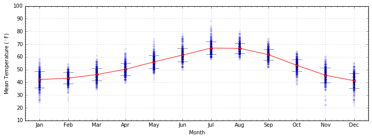
ax.errorbar and plt.errorbar produce scatter points with
errorbars. In this example, the standard deviation for each point sets
the error bar for each point.
Cross Validation
- Model should be able to, to some degree, generate data that looks
like the data that created it
- i.e. model paramters shouldn’t change drastically with random cuts of data
- Want to decouple model parameters from distinct variance in the data
- Split data into training and testing sets
- Scikit-learn cross-validates with
sklearn.cross_validation:
- train_test_split: split data into two sets, with specified fractions
- ShuffleSplit: split data into N shuffled training/test sets
- KFold: split data into K chunks, and iterate through to validate model using one chunk as the training set and the other K - 1 chunks as the test sets
- StratifiedKFold: same thing as K-Fold cross validation, but preserves ratios of labeled data
- A better estimation of confidence intervals; can now base them on the standard deviation of cross-validated parameter estimations
In [4]:
import sklearn.cross_validation as cv

mean_temps = []
september_temps = seattle_weather[seattle_weather.month == 9]["mean_temp"]

for ii in range(10):
    X_train, X_test = cv.train_test_split(september_temps, test_size=0.33)
    mean_temps.append(np.mean(X_train))

the_validated_average_temp = np.mean(mean_temps)
print("Mean Temperature in September: %.2f degrees" % the_validated_average_temp)
Mean Temperature in September: 61.80 degrees
In [5]:
sig = np.std(mean_temps)
out_str = "Mean Temperature in September: %.2f" % the_validated_average_temp
out_str += "\n\t68-pct confidence int:\t (%.2f, %.2f)" % (the_validated_average_temp - sig, the_validated_average_temp + sig)
out_str += "\n\t95-pct confidence int:\t (%.2f, %.2f)" % (the_validated_average_temp - 2*sig, the_validated_average_temp + 2*sig)
out_str += "\n\t99.7-pct confidence int: (%.2f, %.2f)" % (the_validated_average_temp - 3*sig, the_validated_average_temp + 3*sig)
out_str += "\n\nThe true mean: %.2f" % np.mean(september_temps)
print(out_str)
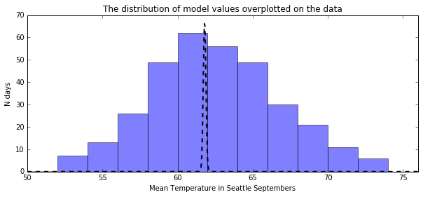
Mean Temperature in September: 61.80
        68-pct confidence int:   (61.71, 61.89)
        95-pct confidence int:   (61.62, 61.98)
        99.7-pct confidence int: (61.53, 62.07)

The true mean: 61.77
In [19]:
from scipy.stats import norm

plt.figure(figsize=(10, 4))
plt.title("The distribution of model values overplotted on the data")
plt.hist(september_temps, bins=np.arange(50, 76, 2), alpha=0.5)
x = np.linspace(50, 76, 1000)
plt.plot(x, 15 * norm.pdf(x, the_validated_average_temp, sig), color='k', linestyle="--", linewidth=2)
plt.xlim(50, 76)
plt.xlabel("Mean Temperature in Seattle Septembers")
plt.ylabel("N days")
plt.show()
Univariate Linear Regression
A univariate linear regression model tells you how one quantitative, continuous variable (\(y\)) changes with the change in one other quantitative, continuous variable (\(x\)).
Has two parameters
- \(b\): The value that \(y\) takes when \(x\) is zero; called the intercept
- \(m\): The value that scales \(y\) with \(x\); called the slope
Looks like...
\[y = m\,x + b\]sklearn.linear_model.LinearRegressionproduces a best-fit model of \(y\) given some \(x\) values
Example: Predicting a Pitcher’s Salary
One of the best things that a pitcher can do is strike out the batter. So, it’s reasonable to assume that that pitcher’s value to the team (the salary they’re paid) should scale with how many strikeouts they ...inflict?
In [6]:
baseball_dir = "../downloads/baseballdatabank-master/core/"
salaries = pd.read_csv(baseball_dir + "Salaries.csv", sep=",")
pitching = pd.read_csv(baseball_dir + "Pitching.csv", sep=",")
rename_these = {"G": "games", "W": "wins", "L": "losses", "H": "hits",
               "WP": "wild_pitches", "R": "runs_allowed", "SO": "strikeouts",
               "SHO": "shutouts", "SV": "saves", "IPouts": "outs_pitched",
               "BB": "walks", "BFP": "batters_faced"}
pitching.rename(columns = rename_these, inplace=True)
In [7]:
total_salaries = salaries.groupby(["playerID"])["salary"].sum()
total_pitching = pitching.groupby(["playerID"])[["games", "wins", "losses",
                                                 "hits", "wild_pitches",
                                                 "runs_allowed",
                                                 "strikeouts", "outs_pitched",
                                                 "shutouts", "saves",
                                                "walks", "batters_faced"]].sum()

all_stats = pd.concat((total_pitching, total_salaries), axis=1)
all_stats = all_stats[(all_stats.games > 0) & (all_stats.salary > 0)]
In [20]:
plt.figure(figsize=(12, 4))
plt.scatter(all_stats.strikeouts, all_stats.salary, edgecolor="None",
            s=5, c='k', alpha=0.2)
plt.yscale("log")
plt.xlabel("Strikeouts", fontsize=12); plt.ylabel("Salary ($)", fontsize=12)
plt.minorticks_on()
plt.xlim(-50, 2750)
plt.show()
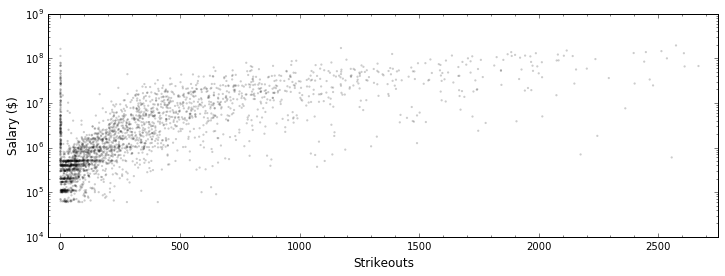
Although it’s been rescaled, this relationship looks like it COULD be a linear relationship. So, let’s make one
In [31]:
from sklearn import linear_model

kfolds = cv.KFold(len(all_stats), n_folds=10)

regressor = linear_model.LinearRegression()
Xvals = np.array(all_stats.strikeouts)[:, np.newaxis]
yvals = np.array(all_stats.salary)

slopes, intercepts = [], []

for train_index, test_index in kfolds:
    X_train, X_test = Xvals[train_index], Xvals[test_index]
    y_train, y_test = yvals[train_index], yvals[test_index]
    regressor.fit(X_train, y_train)
    slopes.append(regressor.coef_)
    intercepts.append(regressor.intercept_)

slope = np.mean(slopes)
intercept = np.mean(intercepts)

regressor.coef_ = slope
regressor.intercept_ = intercept

print("Our model is:\n\tSalary = %.2f x N_strikeOuts + %.2f" % (slope, intercept))
Our model is:
        Salary = 25920.75 x N_strikeOuts + -1011904.28
In [32]:
import matplotlib.pyplot as plt
%matplotlib inline

plt.figure(figsize=(12, 4))
plt.scatter(all_stats.strikeouts, all_stats.salary, edgecolor="None",
            s=5, c='k', alpha=0.2)
plt.scatter(Xvals, regressor.predict(Xvals), edgecolor="None",
            s=2, c='r')
plt.yscale("log")
plt.xlabel("Strikeouts", fontsize=12); plt.ylabel("Salary ($)", fontsize=12)
plt.minorticks_on()
plt.xlim(-50, 2750)
plt.show()
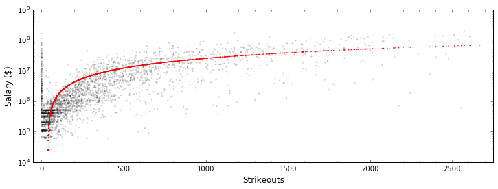
We can tell by eye that this data isn’t well-fit by this model. Let’s quantify this with the “score” of the linear model
In [24]:
print("Score: {0}".format(regressor.score(Xvals, yvals)))
Score: 0.4633007599952645
This score captures the coefficient of determination, which tells us effectively how much of the variability of the data is captured by this model and ranges between 0 and 1. A score closer to zero indicates a model that largely fails to capture the data. Be suspicious of any score that’s too close to 0 or too close to 1.
Multivariate Linear Regression
Most real-world phenomena are not the result of one single cause. Consider the price of a home. It’s not just the number of bedrooms that affect the price, but also the number of bathrooms, the square footage, the age, etc...
Or, consider again the case of predicting a baseball pitcher’s career earnings.
Data source: Sean Lahman’s Baseball Database
In [8]:
plt.figure(figsize=(12, 4))
plt.scatter(all_stats.strikeouts, all_stats.salary, edgecolor="None",
            s=5, c='k', alpha=0.2)
plt.yscale("log")
plt.xlabel("Strikeouts", fontsize=12); plt.ylabel("Salary ($)", fontsize=12)
plt.minorticks_on()
plt.xlim(-50, 2750)
plt.show()

Clearly, while salary is fairly well-predicted by the number of career strikeouts, there’s more to a pitcher’s salary than that. Let’s try to make our univariate linear model better by adding in more characteristics to our model, making our model multivariate.
Note that a “linear” model does NOT mean that you only use one value to determine one other value, as in \(y=m\,x+b\). It means that the individual qualitative, continuous variables \(x_i\) that determine your \(y\) value are added to each other in a linear way, e.g.
In [33]:
N_folds = 10
kfolds = cv.KFold(len(all_stats), n_folds=N_folds)

regressor = linear_model.LinearRegression()
valid_data = ["strikeouts", "runs_allowed", "saves", "hits",
             "shutouts", "wins", "losses", "outs_pitched",
             "walks", "batters_faced"]
Xvals = np.array(all_stats[valid_data])
yvals = np.array(all_stats.salary)

coeffs, intercepts = [], []

for train_index, test_index in kfolds:
    X_train, X_test = Xvals[train_index], Xvals[test_index]
    y_train, y_test = yvals[train_index], yvals[test_index]
    regressor.fit(X_train, y_train)
    coeffs.append(regressor.coef_)
    intercepts.append(regressor.intercept_)

coeffs = np.array(coeffs).mean(axis=0) #averages each column
intercept = np.array(intercepts).mean(axis=0)

regressor.coef_ = coeffs
regressor.intercept_ = intercept
In [34]:
print("Score: {0}".format(regressor.score(Xvals, yvals)))
Score: 0.6557068867328253
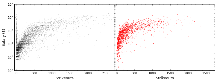
A notably better result. Still not perfect, but we’re getting about 20% more of the variability of the data. Let’s plot our actual data and our model data side by side.
In [14]:
fig = plt.figure(figsize=(12, 4))
fig.subplots_adjust(wspace=0)
ax = plt.subplot(121)
ax.scatter(all_stats.strikeouts, all_stats.salary, edgecolor="None",
            s=5, c='k', alpha=0.2)
ax.set_yscale("log")
ax.set_xlabel("Strikeouts", fontsize=12); ax.set_ylabel("Salary ($)", fontsize=12)
ax.set_xlim(-50, 2750); ax.minorticks_on()

ax = plt.subplot(122)
ax.scatter(Xvals[:, 1], regressor.predict(Xvals), edgecolor="None",
            s=2, c='r')
ax.set_xlabel("Strikeouts", fontsize=12)
ax.set_ylim(1E4, 1E9)
ax.set_yscale("log"); ax.set_yticklabels([])
ax.set_xlim(-50, 2750); ax.minorticks_on()

plt.show()
Take Care with Multivariate Models
- Multivariate linear models assume that each added variable is independent of the others.
- Given this, you want to beware of multicollinearity: two or more characteristics correlated with each other (e.g. “strikeouts” and “outs_pitched”).
- To ensure that highly-correlated variables are not included together, add new variables carefully and gradually. For more, see this set of pages on multicollinearity and other regression pitfalls.